Tokens & Themes
Themes
A theme is a collection of tokens that define the visual appearance of a product or brand. All ODS products and brands share the same thematic base definition, although there is the possibility of extended token definitions for a country's needs, within its own libraries (i.e. country-specific tokens).
What is a theming system?
A theme system is a set of color swatches and interchangeable styles that affect the way things are displayed (think background color, text color or border color, spacing, corner radius), but not content, hierarchy, etc. Simply put, theming allows us to code a component once but design it in multiple ways.
If it affects color or shape it is relevant to the theme. Otherwise, it is not.
Uses of theming
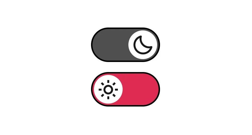
Dark and light mode
Essential for accessibility in modern product development to accommodate visually impaired users.

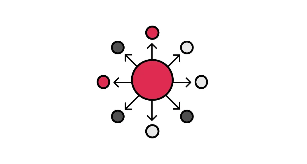
Multi-brand
When there are several products that visually change according to the brand using the same components

Marketing campaigns
Theming allows style changes to be made for marketing campaigns at specific times

Theme levels
What is a Context theme?
The context theme is applied to a container to which the Regular or Alternative theme has been applied, and depending on that context the components that are positioned within it change to enhance contrast.
What can we control with theming?
- Color palettes
- Typography and font styles
- Spacing and size
- Responsive breakpoints
- Transitions and animations
- Radios
- Icons
- Logos
- Illustrations
- Color
- Radios
- Logos
- Change context theme in the same screen in different Products or Brands
- It is not possible to change the architecture of elements within a component.
- It is not possible to change the components in a Product screen (L1).
- It is not possible to change component variants in a Product screen (L1).