Design System Concepts
These concepts form the underlying functional language that allows the Design System to use the same terminology across components and create a cohesive system.
Terms
These terms are used within our foundations and components to describe the features and properties and are meant to create a shared language within the design system.
| Term | Description | Values |
|---|---|---|
| Action | Describes the type of action to be taken and defines color | Primary, Secondary, Ghost, Alternative |
| Alignment | Alignment of component contents | Top, Right, Bottom, Left, Center, Justify, and all cross permutations |
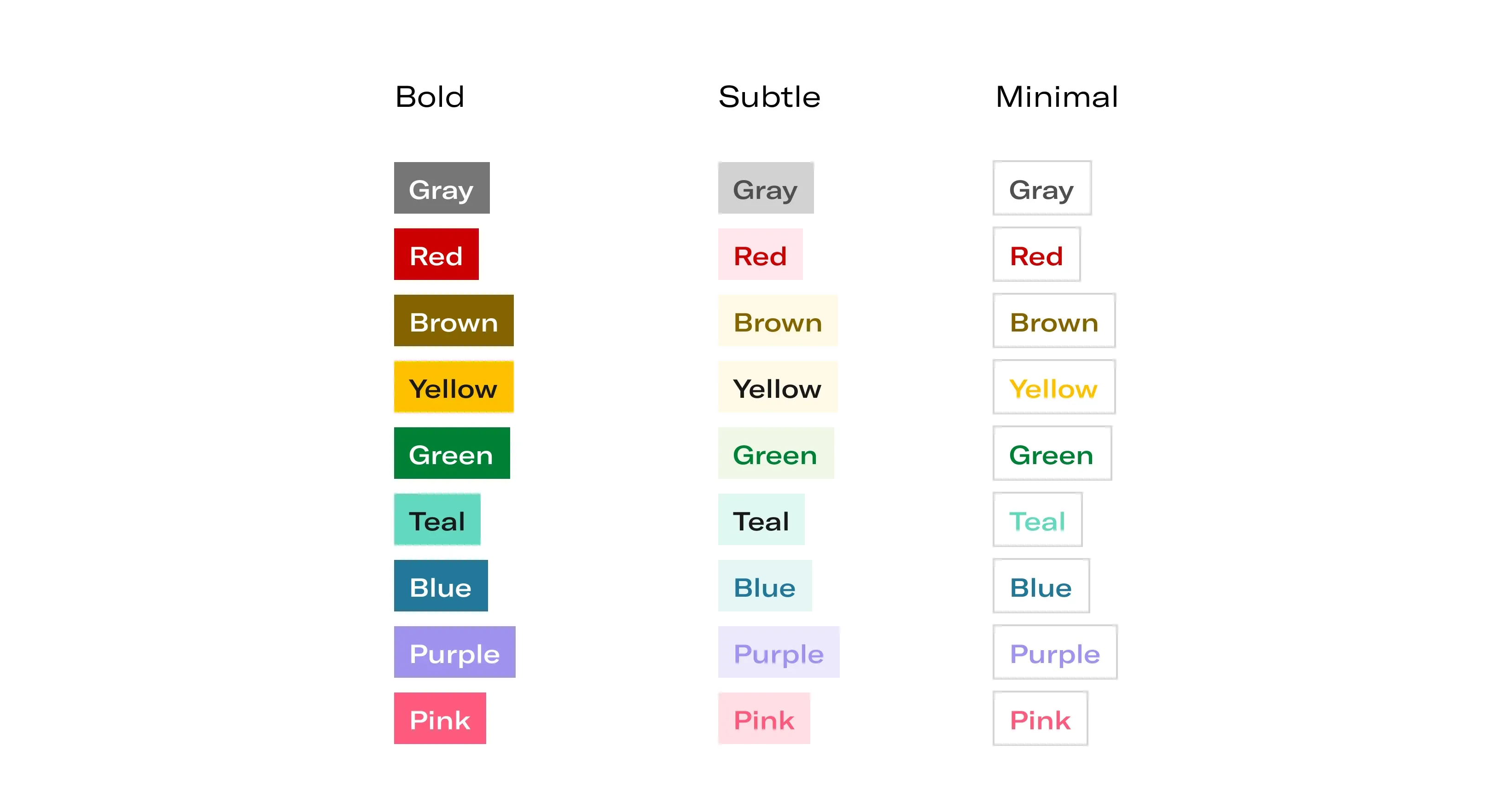
| Color | Component color from a ramp in the color system | Gray, red, brown, yellow, green, teal, blue, purple, pink |
| Elevation | Visually elevates the component on the screen | 00 - 10 |
| Expandable | Component can expand to show more detail | False / True |
| Expanded | Component is expanded to show content | False / True |
| Collapsed | Component is collapsed to hide content | False / True |
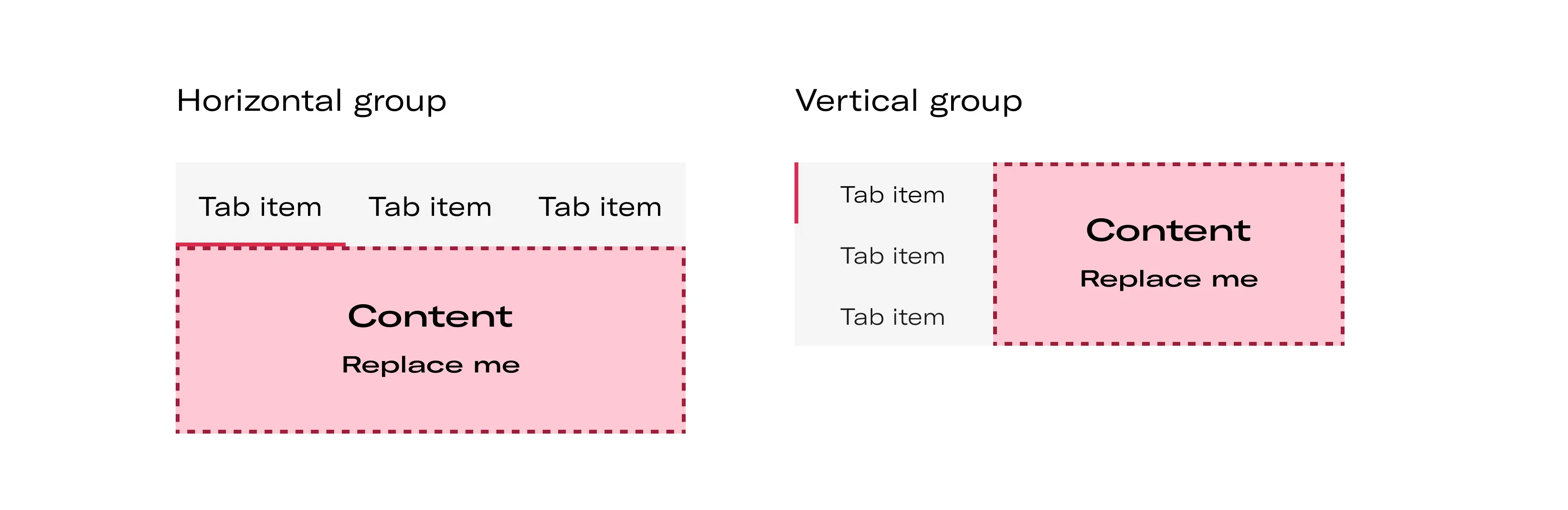
| Orientation | How a group of content is arranged | Horizontal, Vertical |
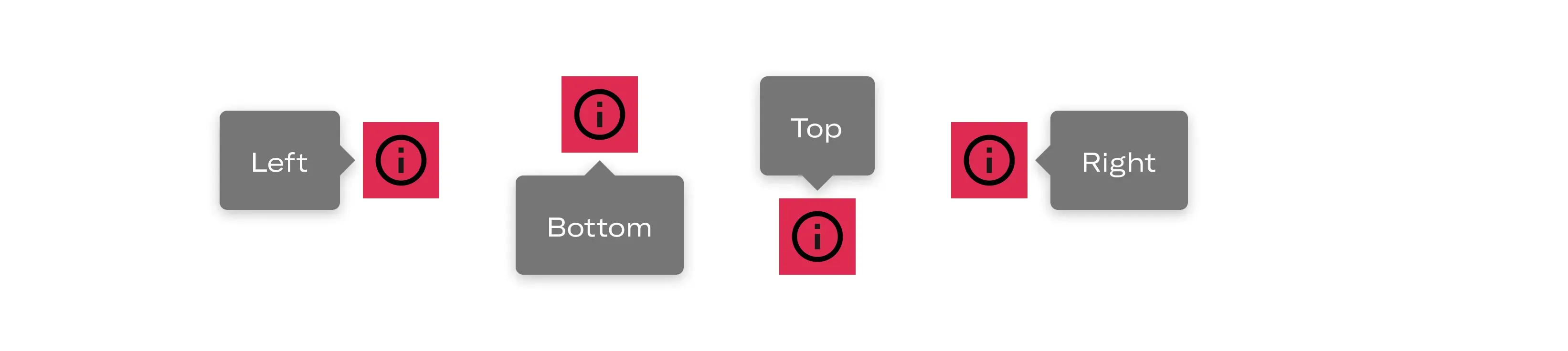
| Placement | Where the component renders in relation to other components | Top, Right, Bottom, Left, and all cross permutations |
| Position | Places a component at the start or end of its container | Leading / Trailing |
| Size | Size of component | Extra Small (XS), Small (s), Medium (M), Large (L), Extra large (XL) |
| States | Html element states that have been styled | Default, Hover, Active, Disabled, Focused, |
| Status | Visual status of component, overrides color | None, Information, Success, Warning, Error, Loading |
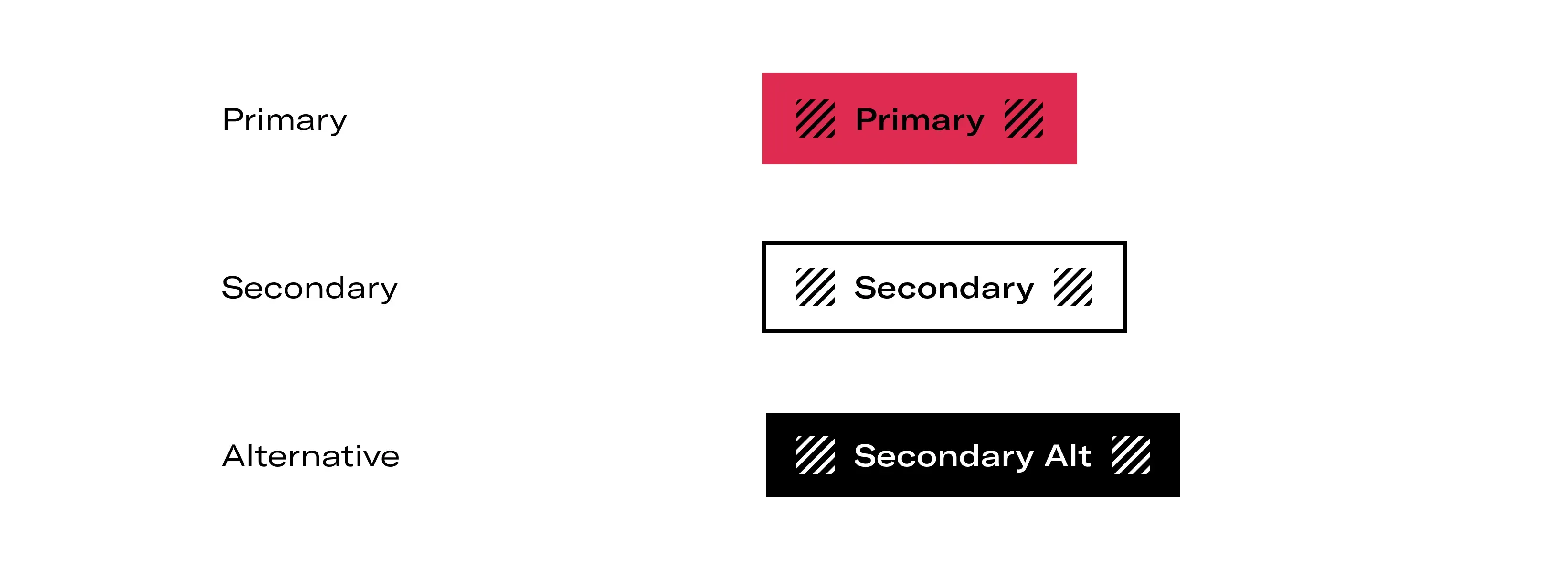
Action
Action type is used to describe the type of action that is displayed within the button and is also used to define button styling. There are five available— primary, secondary, info, contrast and destructive.
| Term | Used for |
|---|---|
| Primary | The most important call to action on the page that need high visibility |
| Secondary | Non-primary actions on the page |
| Alternative | Placed over dark backgrounds |
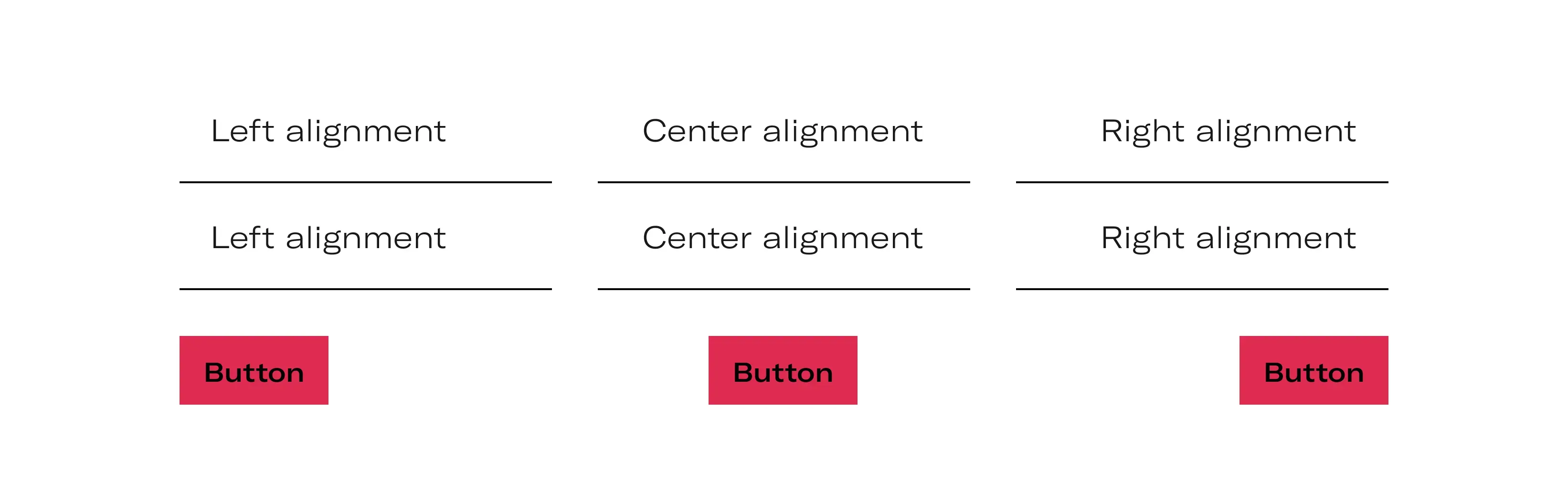
Alignment
Alignment is used to define the alignment of elements inside of the component.
Color
Color allows for the component to choose a pre-defined color from each distinctive color ramp. Color can be combined with emphasis to choose a bolder or lighter color from a specific color ramp.
Elevation
Elevation visually elevates the component on the screen. There are two possible values with 00 being the lowest value and 10 being the highest.

| Depth level | Uses |
|---|---|
| 00 | Background |
| 10 | Input, cards |
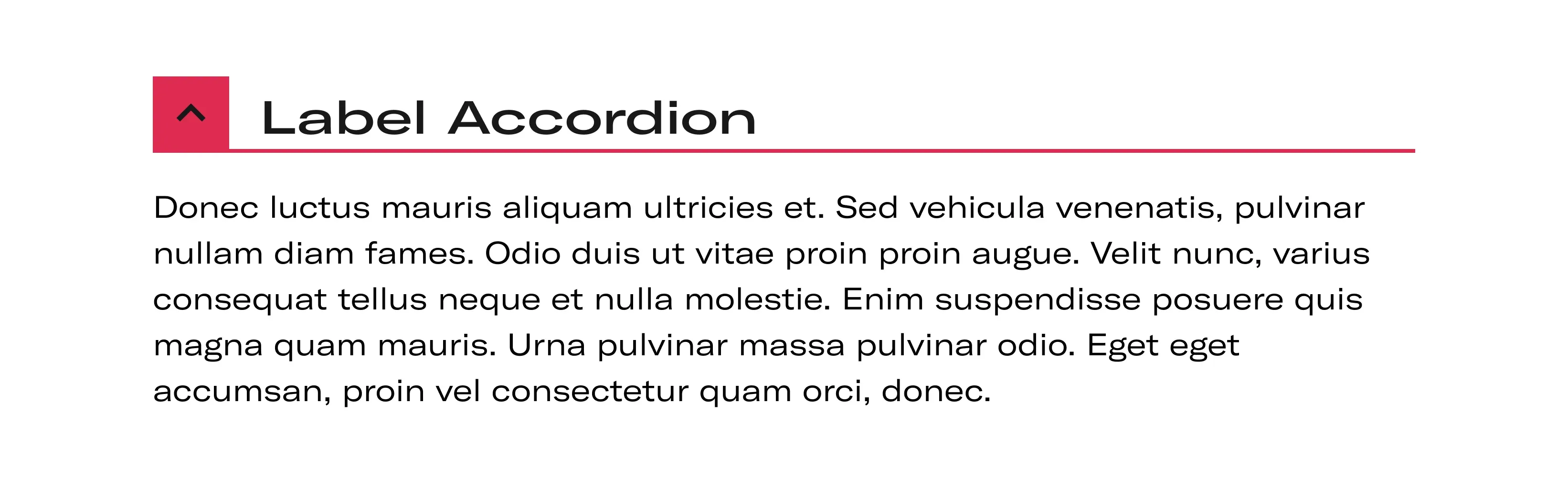
Expandable
Component can expand to show more detail. States can be expanded or collapsed
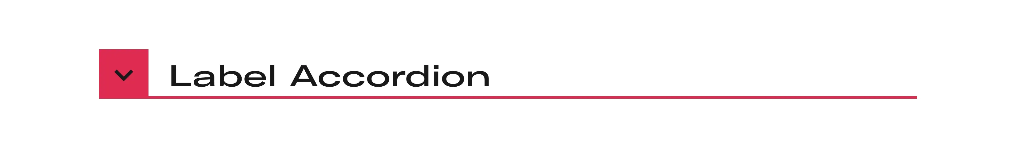
Collapsed
Component is collapsed to hide content.
Expanded
Component is expanded to show content.
Orientation
Orientation is the direction that a group of content is arranged on the screen.
Placement
Placement refers to where a component renders in relation to other components.
Position
Position places a component at the start or end of its container, typically leading or trailing.

Sizes
Size value range from extra small to extra large. Most sizes can be used in any interface type depending on the user needs and interface requirements. Not all components come in all sizes. Small, medium and large are the core sizes.
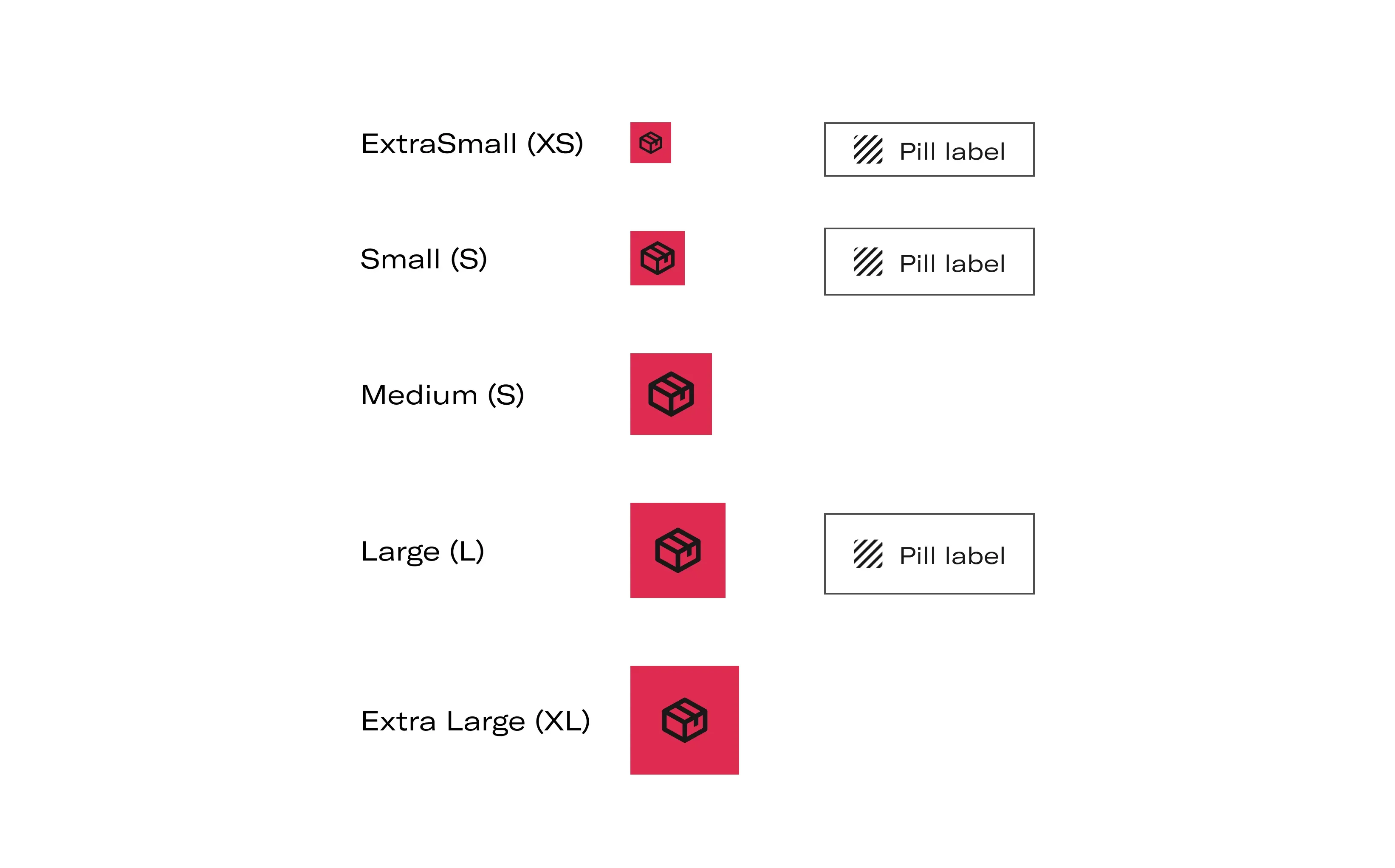
| Value | Typical Height | Usage |
|---|---|---|
| Extra small (XS) | 24px | High density applications, ancillary design items |
| Small (S) | 32px | Desktop productivity applications |
| Medium (M) | 48px | Default recommended size |
| Large (L) | 56px | Mobile applications, consumer applications |
| Extra Large (XL) | 64px | Mobile applications, consumer applications |
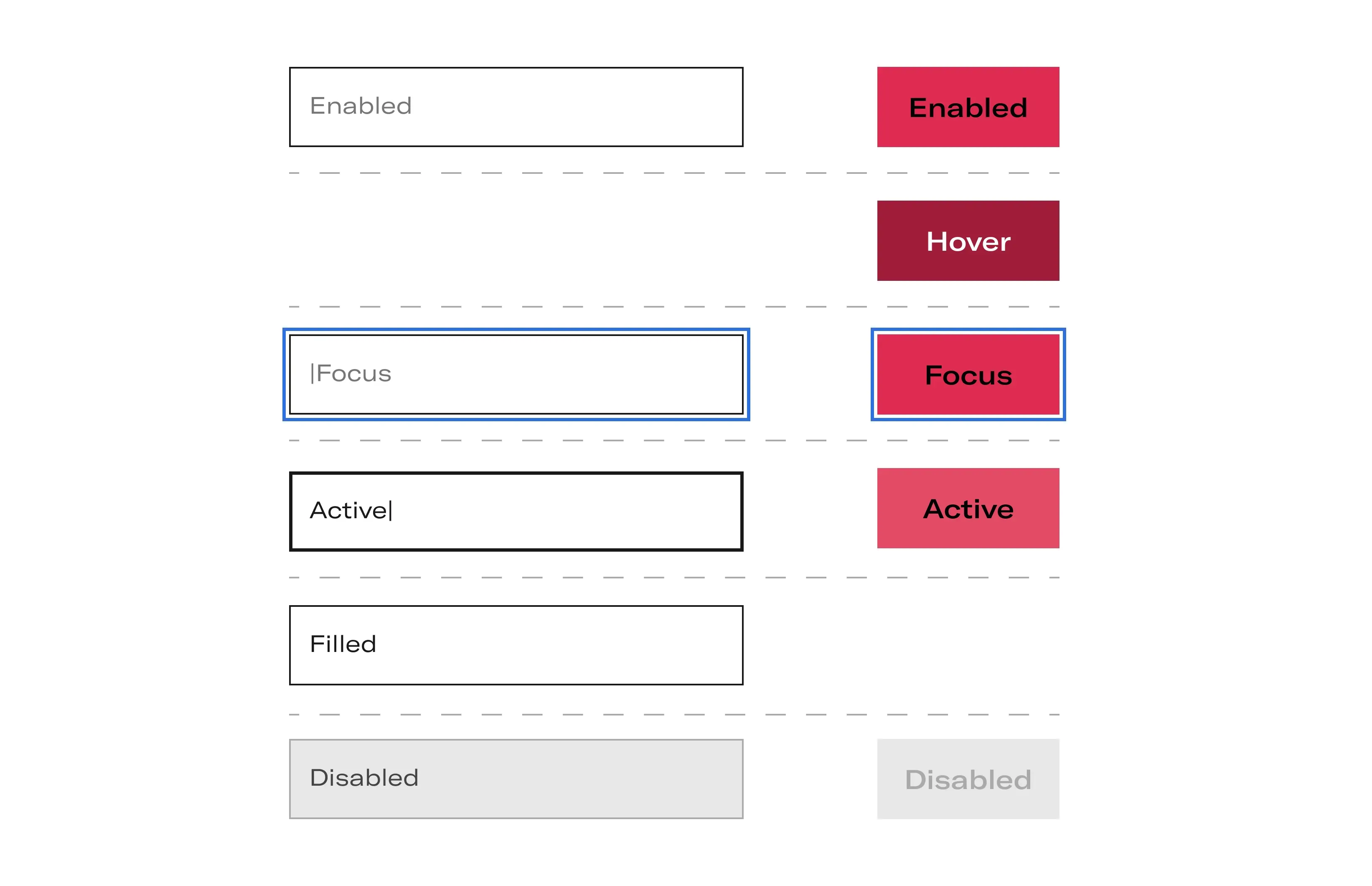
States
State defines styles for HTML element states.
Status
Status is the visual status of component and the component, which can be used to either define the component color or temporarily override the component color.
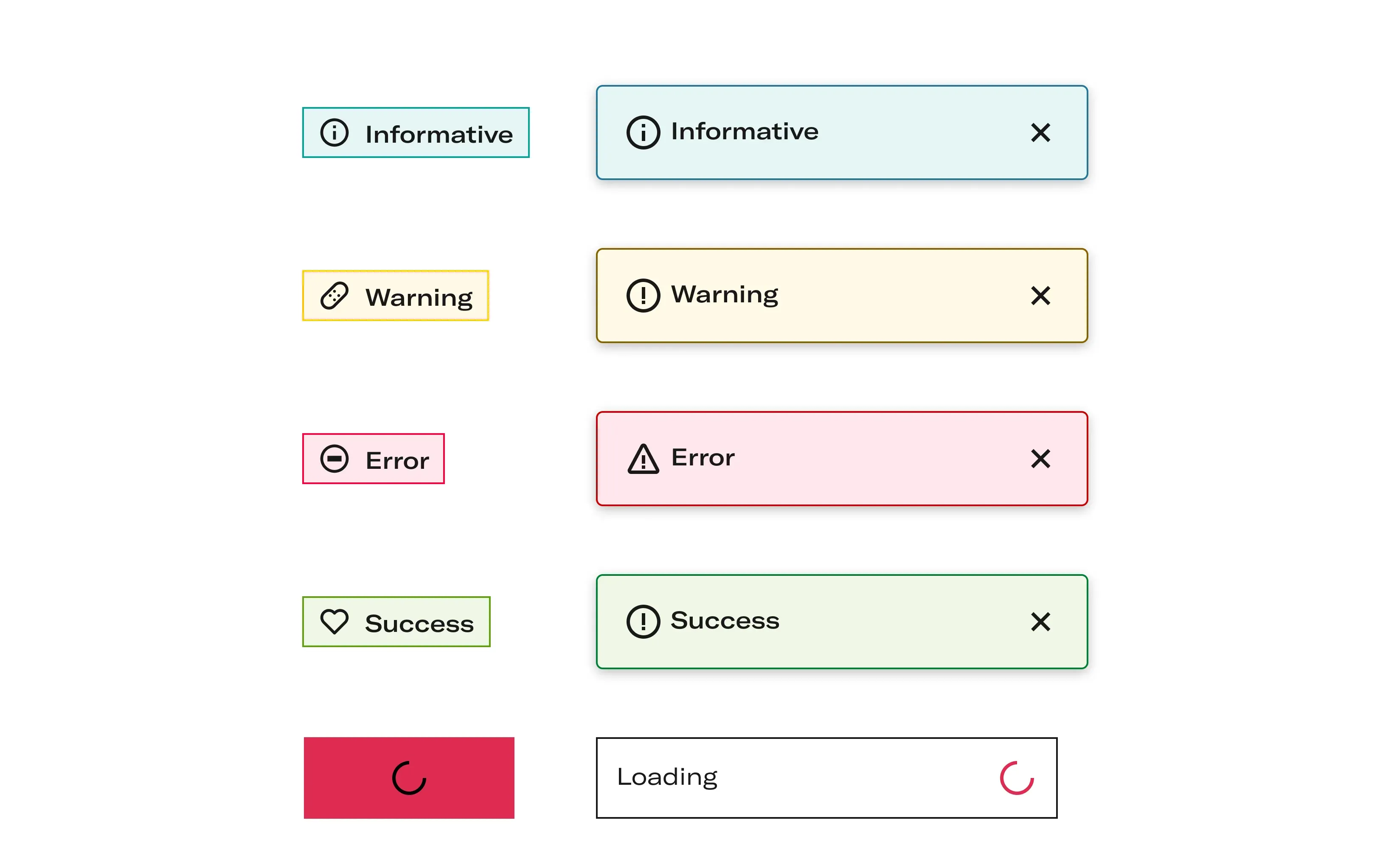
| Status | Usage |
|---|---|
| None | Default status set for components |
| Information | Typically blue in color and used for general information |
| Warning | Typically yellow or orange in color and used for non-critical errors. Orange has higher contrast on light backgrounds and should be used for icons, text or thin lines. Yellow can be used for a background fill with dark text. |
| Error | Typically red in color and used for critical errors and system alerts |
| Success | Typically green in color and used for when a successful action has gone through |
| Loading | Typically used to indicate system loading |
Anatomical languaje
| Term | Description |
|---|---|
| Description | Content section of a container component |
| Fill | Colored portion of a component |
| Footer | Bottom section of a container component, often holding actions |
| Handle | Component that is dragged along a track |
| Header | Header section within a container component |
| Label | A string showing information about a component |
| Secondary label | Additional label that provides supporting text in an implied hierarchy |
| Line separator | Line that separates between components |
Description, footer & subtitle
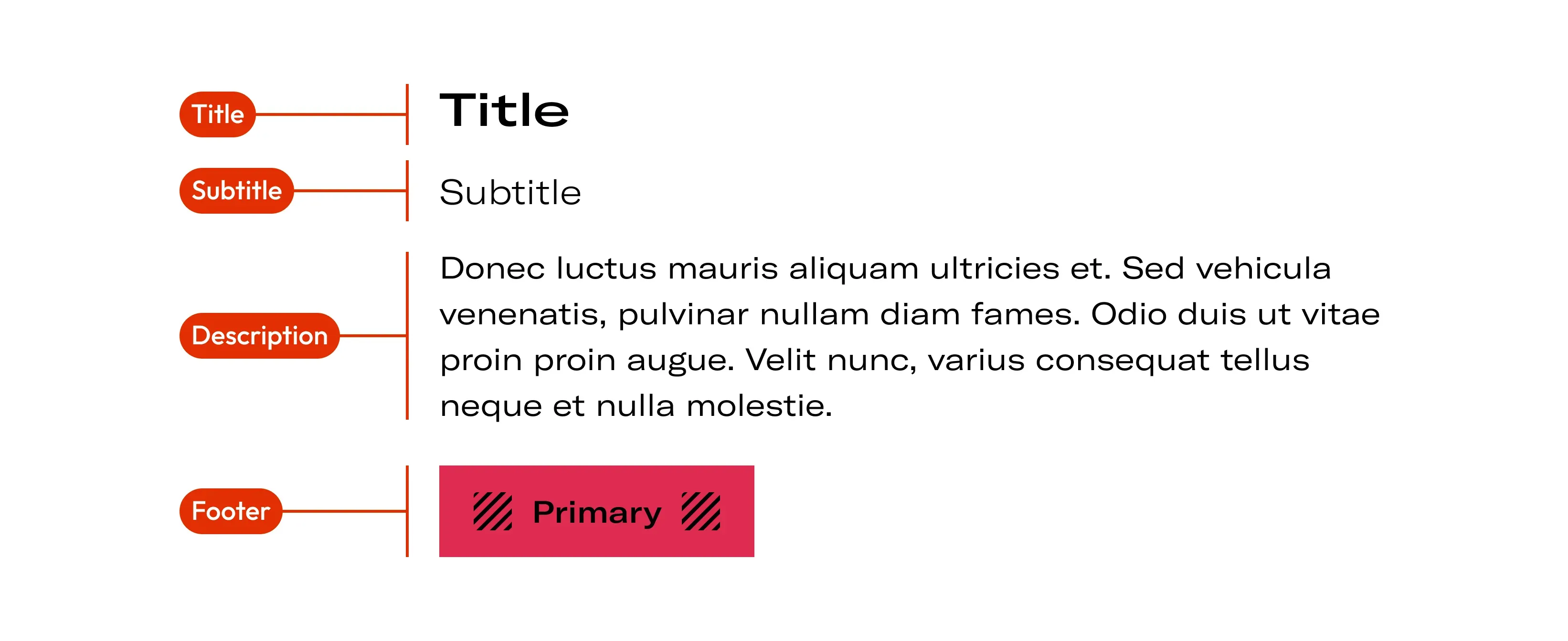
| Term | Description |
|---|---|
| Description | Content section of a container component |
| Title & subtitle | Header section within a container component |
| Footer | Bottom section of a container component, often holding actions |
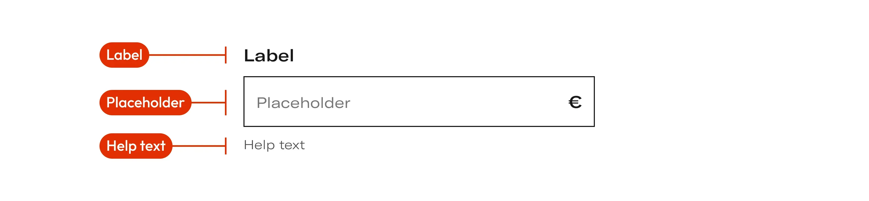
Label, placeholder & help text
| Term | Description |
|---|---|
| Label | Indicates the information requested from the user |
| Placeholder | The text inside the field comes in two versions: it is empty state text that is replaced by user information later |
| Help text | Classic help text to give some more idea or condition about what is requested. It align to the left side |
Separator
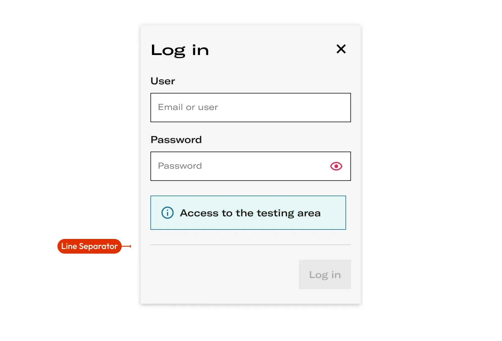
| Term | Description |
|---|---|
| Line Separator | Line that separates between components |