
components
Breadcrumbs
v.1.0.0 | Saturn Storybook
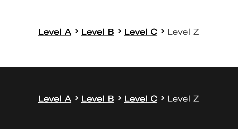
List of links that help visualize a page's location within a site's hierarchical structure.
Components
Play with the component with our playground.
Anatomy

| Name | Description |
|---|---|
1 Required | Name of each of the navigation level where the user has navigated. They are clickable links for the user to retrace his steps. The last one is allways in active state and it’s not clickable. |
2 | Provides a distintion between the levels of navigation. |
3 Required | Maximun of 203 characters. |
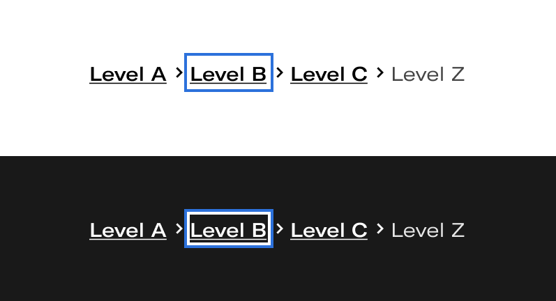
States

Behaviours
- How to navigate breadcrumbs
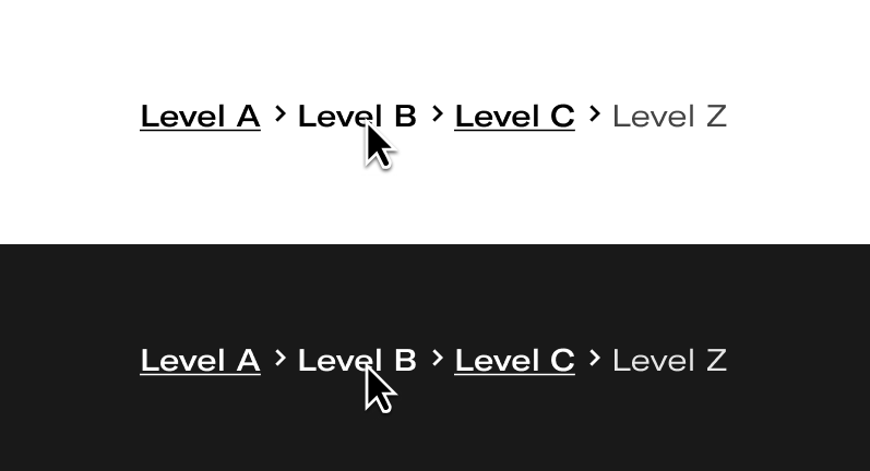
The user can quickly navigate by clicking on any of the levels to move through the different hierarchy levels of the web, either the main level and prior to the current page. The current page, at the level the user is at, is not cyclable.

- When ellipsis appears
If the breadcrumb content is longer than it can grow inside the parent, the breadcrumb text will collapse to a maximum of 20 characters (20 rems) and an ellipsis will be displayed. This applies to all levels except the last one.
- When the ellipsis appears at the last level
If the text in the last level is so long that it cannot go to a line when the other levels are already collapsed, ellipses will appear in this last level until it adapts to the screen resolution.
Do's and dont's

Don’t show too many breadcrumbs at once. By displaying only 5 items in the hierarchy (including the root item, if you are displaying it), users will quickly understand context while still having easy access to any truncated options.

Any level can be truncated.

Do not completely truncate levels.

Ellipses will appear in the last level when the width of the component is greater than the screen resolution.

Breadcrumbs will never go beyond two lines.